SELECTED PROJECT
YR Media
Branding
30+ Anniversary Campaign & Brand Refresh
The direction
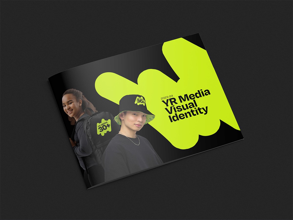
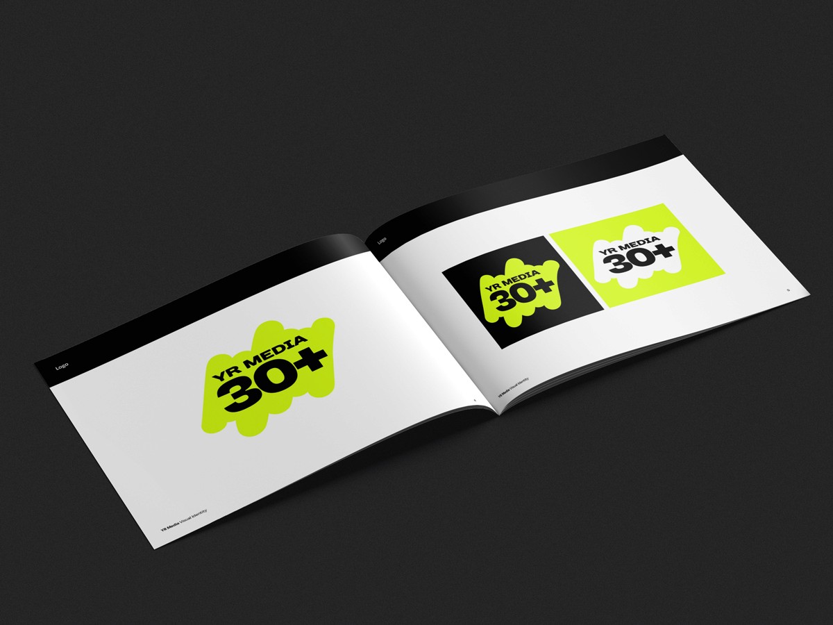
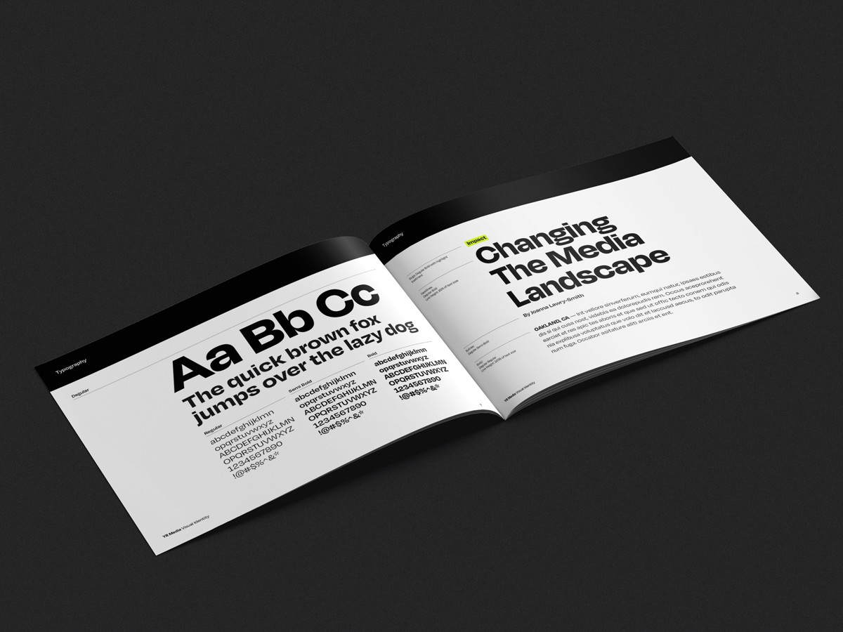
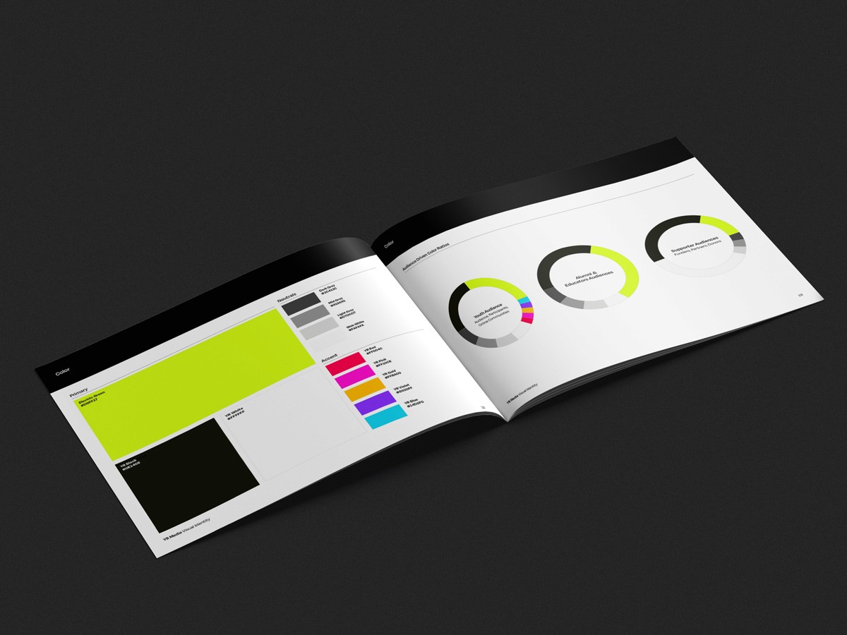
Under the content and design leadership of Pedro Vega Jr., YR Media approached the project through research, creative ideation, and stakeholder collaboration, resulting in a vibrant and cohesive brand refresh: Anniversary Logomark: The newly designed 30+ logo symbolized YR Media’s three decades of impact, with the "plus" sign representing the organization’s commitment to future growth. This icon embodied both YR Media’s past achievements and its energetic path forward.Visual Identity Refresh: To align with YR Media’s bold mission, the primary color shifted to an electric green, invoking vibrancy and energy reminiscent of neon or highlighters. A highlighter-inspired scribble became a recurring motif, symbolizing movement and YR Media’s role in amplifying youth stories.Cohesive Voice Across Platforms: The refreshed identity extended across social media, branded collateral, and a newly launched merch store that directly supported YR Media’s mission. This unified voice reinforced the brand’s values and strengthened community engagement.
The work
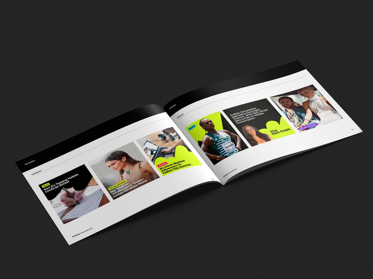
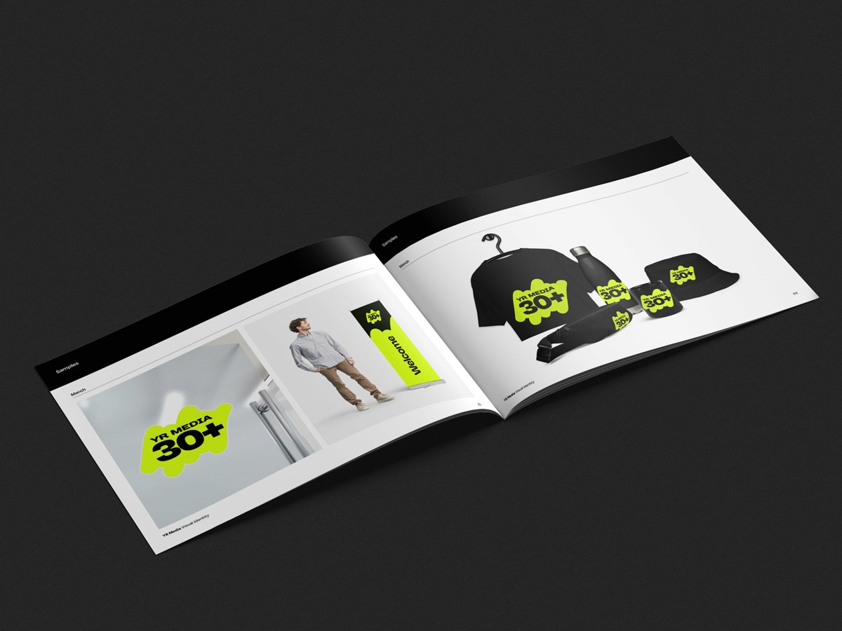
Selected images from this project.
What changed
The 30+ Anniversary Campaign revitalized YR Media’s brand presence with a unified voice and aesthetic. The campaign successfully engaged legacy supporters, attracted new audiences, and contributed to fundraising efforts through branded merchandise. The consistent branding across social media, collateral, and the merch store reinforced YR Media’s mission, setting a strong foundation for future growth.
Have something in mind?
Discuss Your Project